Icon support
The theme adds icon supports with @vuepress/plugin-icon.
Usage
We support multiple types of icons:
iconify(default)fontawesomeiconfont
If you do not want icon support, set plugins.icon to false to disable it.
When using any type of icon, you can also use any image link (relative links are NOT supported).
To specify icon assets, set plugins.icon.assets in theme options:
import { hopeTheme } from "vuepress-theme-hope";

export default hopeTheme({
  plugins: {
    icon: {
      // keywords: "iconify", "fontawesome", "fontawesome-with-brands"
      assets: "fontawesome",
    },
  },
});import { hopeTheme } from "vuepress-theme-hope";
export default hopeTheme({
plugins: {
icon: {
// an url you like
// for example, these websites allows you to generate your own assets:
// - a css assets link in [iconfont.cn](https://www.iconfont.cn/?lang=en-us)
// - a kit link in [fontawesome](https://fontawesome.com)
assets: "/base/my/font-icon/resource.js",
},
},
});import { hopeTheme } from "vuepress-theme-hope";
export default hopeTheme({
plugins: {
icon: {
// an array of above
assets: [
"/base/my/font-icon/resource.js",
"https://example/my/fonr-icon/resouce.css",
"fontawesome",
],
},
},
});To keep simple, we add built-in keywords "iconify", "fontawesome" and "fontawesome-with-brands" support for you to get started easily.
Caution
If you use this plugin for commercial project documentation, iconfont is strongly NOT recommended as iconfont itself is a study/share platform for designers and developers.
Every icon is uploaded by users, and you must get authorized from the author for commercial usage. Also, there could be chance where the uploader obeys usage term. And upload icons where its copyright is at 3rd party.
Adding Icons
In Markdown
Use ::icon decorators... =size /color key=value complex-key="complex value"...:: to insert custom icons.
- A string starting with
=will be treated as a size definition. - A string starting with
/will be treated as a color definition. - Any string which itself is a valid html attribute will parsed, standardized and added to the icon element.
- The rest part will be treated as the icon name.
::icon =16 /red:: <!-- <VPIcon class="icon" color="red" size="16px" -->

::icon rotate vertical-align=middle:: <!-- <VPIcon icon="icon rotate" vertical-align="middle" -->::home /blue::
::b:apple =2rem vertical-align=text-bottom::In Components
Use <VPIcon /> component to add icon in Vue components.
iconprop accepts the icon settings, i.e. icon name or image linkcolorprop accepts a css color value, which will be used as the icon color (optional)sizeprop accepts a css size value, which will be used as the icon size (optional)vertical-alignprop accepts a css value, which will be used as the icon vertical-align (optional)
<VPIcon icon="home" color="red" />
<VPIcon
  icon="//theme-hope-assets.vuejs.press/logo.svg"
  size="4rem"
  vertical-align="middle"
/>
In Configuration
You can set icon in multiple options:
Page: set
iconin frontmatterThis icon will be used in breadcrumb, page title, navbar generated item, sidebar generated item, page nav, etc.
Navbar: set
iconoption in navbar itemsSidebar: set
iconoption in sidebar itemsHomePage: set
iconoption in feature items
Available Icons
- Iconify: https://icon-sets.iconify.design/
- Iconfont: https://www.iconfont.cn/?lang=en-us
- Fontawesome: https://fontawesome.com/search?o=r&m=free
Icon Types
Iconify
For full icon list, see https://icon-sets.iconify.design/. To use a icon, copy it's icon name of iconify-icon in the selector.
Additionally, iconify support the following props:
mode:svg(default)stylebgormaskto change the render icon modeinline:falseto disable inline iconflip:horizontalorverticalto flip the iconrotate:90,180,270to rotate the icon
If you use 1 icon set mostly, you can set the prefix to the icon set name (E.g.: mdi:), Then you can use the icon name without the prefix. Manually declaring a full icon name will override the prefix:
::home:: <!-- mdi:home -->
::svg-spinners:180-ring:: <!-- svg-spinners:180-ring -->
Font Awesome
For free icon list, see https://fontawesome.com/v6/search?o=r&m=free. To use a icon, copy it's icon name in the selector.
The fontawesome keyword only includes the free solid and regular icons. If you want to use the brand icons, you need to use the fontawesome-with-brands keyword.
Solid icons can be used directly. if you want to use regular or brand icons, you need to add the regular: or brands: prefix to the icon name:
::home:: <!-- fas fa-home (solid is default) -->
::solid:home:: <!-- fas fa-home -->
::regular:heart:: <!-- far fa-heart -->
::brands:apple:: <!-- b:apple -->
Besides, a three letter prefix, first letter or full class name are also supported:
::s:home:: <!-- fas fa-home -->
::fas:home:: <!-- fas fa-home -->
::fa-solid:home:: <!-- fa-solid fa-home -->

::b:apple:: <!-- b:apple -->
::fab:apple:: <!-- b:apple -->
::fa-brands:apple:: <!-- fa-brands fa-apple -->

::r:heart:: <!-- far fa-heart -->
::far:heart:: <!-- far fa-heart -->
::fa-regular:heart:: <!-- fa-regular fa-heart -->
You can add other classes that fontawesome supports after the icon name and split them with a space, where fa- prefix is optional:
<!-- a small size icon -->

::home fa-sm:: <!-- fas fa-home fa-sm -->

<!-- rotate 180deg -->

::home rotate-180:: <!-- fas fa-home fa-rotate-180 -->
See https://docs.fontawesome.com/web/style/styling for all available classes.
Fontaweome Kits and Pro features
By default, we use jsdelivr CDN to load V6 version of fontawesome free icons. This should be enough for most open source projects.
Besides, you can purchase at fontawesome.com to use kits.
Fontawesome kits with pro features support pro icons, more icon styles and uploading your own icons.
For details, please follow fontawesome document.
Iconfont
Iconfont is a vector icon management and communication platform created by Alimama MUX.
Every designer can upload icons to Iconfont platform, and users are allow to create projects from these icons. The project can be used in a variety of formats.
Generating Your Own Iconfont Links
Create a project
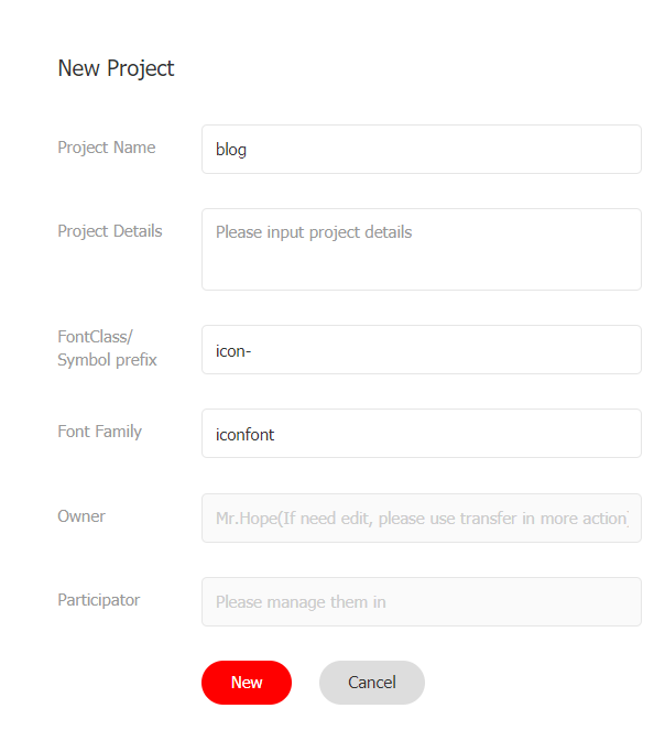
First, you need to create a new project to set and manage your website's icons:
- Log in to Iconfont.
- Find "Resources → My Projects" at the top of the website, and click the "New Project" icon in the upper right corner.
- Set a recognizable project name
- Fill in
FontClass/Symbol prefixwithicon-. You can also fill in according to your preference, but you need to manually set this value toprefixoption with an extra"iconfont"class in the front, e.g.:iconfont icon-

Import Icon
Search and find the icon you want to use, and click the "Add to Library" button on the icon
When you complete searching, click the "Add to Library" icon in the upper right corner, click "Add to Project" below, select the project you created then confirm.
Edit Icon
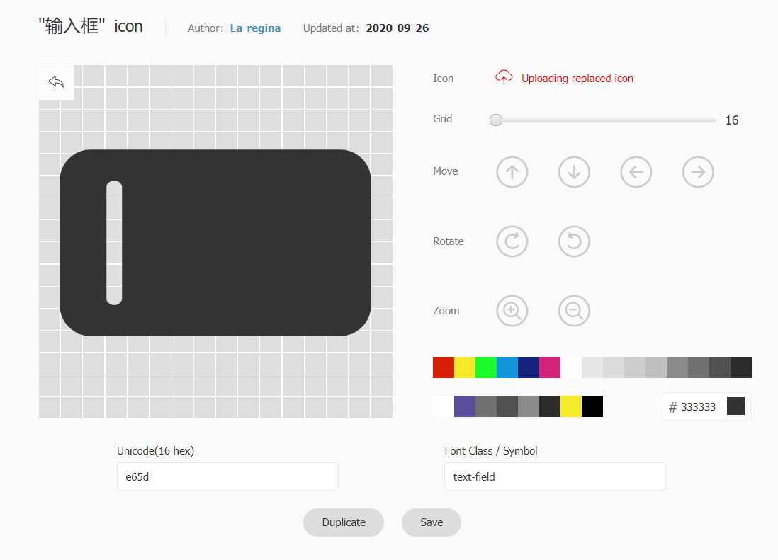
On the project page, you can edit the icons in the project, including adjustments with position, size, rotate, color, Unicode number and Font Class / Symbol.

Generate Links
Click the "Font Class" button above the project and click Generate.

Then set assets option with the generated link.
Tips
You need to regenerate and update the link every time you add a new icon.
Images
Images links are supported with any icon types (relative links are NOT supported).
A full link:
Absolute link:
A full link: ::https://theme-hope-assets.vuejs.press/logo.svg::

Absolute link: <VPIcon icon="/favicon.ico" />

<!-- favicon.ico should be placed in .vuepress/public folder -->
<!-- ::/favicon.ico:: is NOT supported as it will be parsed as color -->
Changelog
b3c03-on1bd5f-on68504-onac0df-on55e92-on1e314-one639c-on1b917-on8ad28-onedfd5-on871a1-on749b0-on6a98f-ona50a4-on54c46-onbac94-onfb6da-on3a6d6-on2a306-on7cb0d-one1f1c-ondf425-onaddb6-onef3d6-on869de-on98b0c-on8174c-on8286f-on52ad0-onedfb0-onf07bd-on2243a-onbffde-on2fa50-on9856d-onc10f5-on010a2-on48bca-onad023-on1ca3e-onfd395-on1eb77-on60053-on0c093-on4d1ba-onf6ff0-on37324-on234d7-on83b5d-on3c199-on